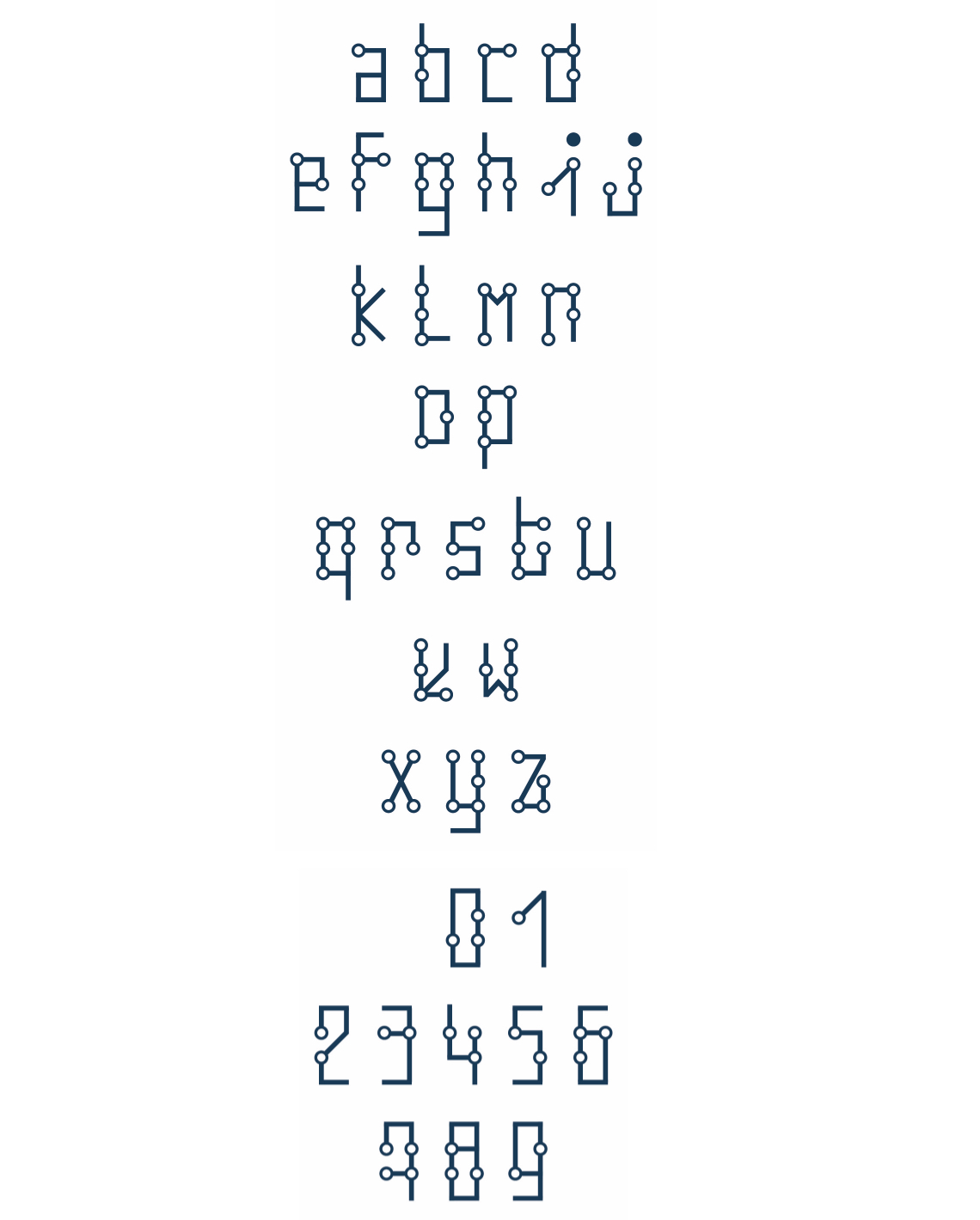
Ebraille font was developed to bridge the gap between the visually impaired person and the non-visually impaired person to make communication faster and easier. While making this font, the original Braille font was thoroughly studied and understood first. Its advantages and shortcomings were taken into consideration and the main aim was to try and solve these shortcomings. Every alphabet in Braille script which is made by embossed dots was studied. Then the Roman script was incorporated in a basic grid of Braille script. The main consideration was to keep it simple, not too complicated so that it can be used by everyone without any difficulties. In Ebraille font every alphabet is readable concerning both the scripts. i.e visually impaired person and non-visually impaired person can read the script at the same time without any difficulties. This font follows the basic principles of typography keeping the basics of Braille intact.
Overview

Problems
Braille - opens up the wonderful world of reading for visually impaired people. Even though it has many advantages, it has its disadvantages too.
- Unavailability of books in Braille makes it difficult for visually impaired students because they don’t have enough study materials for practice and do not get to enjoy many books like normal students.
- Cannot be read by a non-visually impaired person who has not learned it.
- The visually impaired person can never be cheated and they feel more confident to interact with a visually able person like one among them without any apprehensions.
- The script is not used everywhere like railway or bus tickets, bills price tags and other important documents which makes it difficult for blind people and chances of them getting cheated is high.
- The funding to teach Braille is very low.
- The facilities provided for Braille schools are not of good standard creating a gap between visually impaired students and non-visually impaired students which in turn reduces communication between them.
Process
When I thought of doing this topic the first thing I did proper detailed research about this topic. The Braille font in particular and the problems faced by people using this script o that I can try and come up with some solutions for it. First I surfed the internet to find and learn the basics of braille script. Also checked for any existing braille font. After thorough research, I found the embossed braille script and design of roman script with braille script. But it wasn't properly chartered. I approached a blind school and interviewed the teaching staff. Also observed the students, the way they learn the script and communicate with their friends, atmosphere etc. They have a specially designed pad and a scale on which dots are etched. This scale is used to write individual alphabets with embossing paper technique.
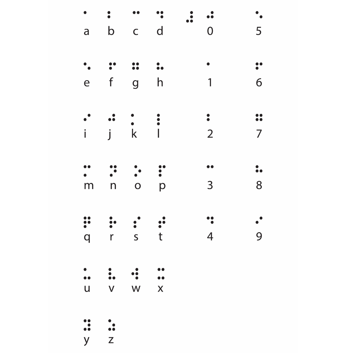
Design Rules
Following rules, I followed while designing this font.
- The font should possess the characteristics of both Braille as well as the Roman script.
- The font should have the visual and physical characteristic of both the scripts.
- The lines of the Roman character should pass through every dot of the Braille language.
- Create and follow the grid for font creation.
Scribbles
Keeping my hands on paper and scribbles gave me the confidence to go ahead with the font idea I had in my mind. My aim was simple, it was to make life easier for the blind people as well as people surrounding them and increase communication, So thinking of how rules of a Roman script and those of Braille script can be combined. So I created a grid which could combine both Roman and Braille font.
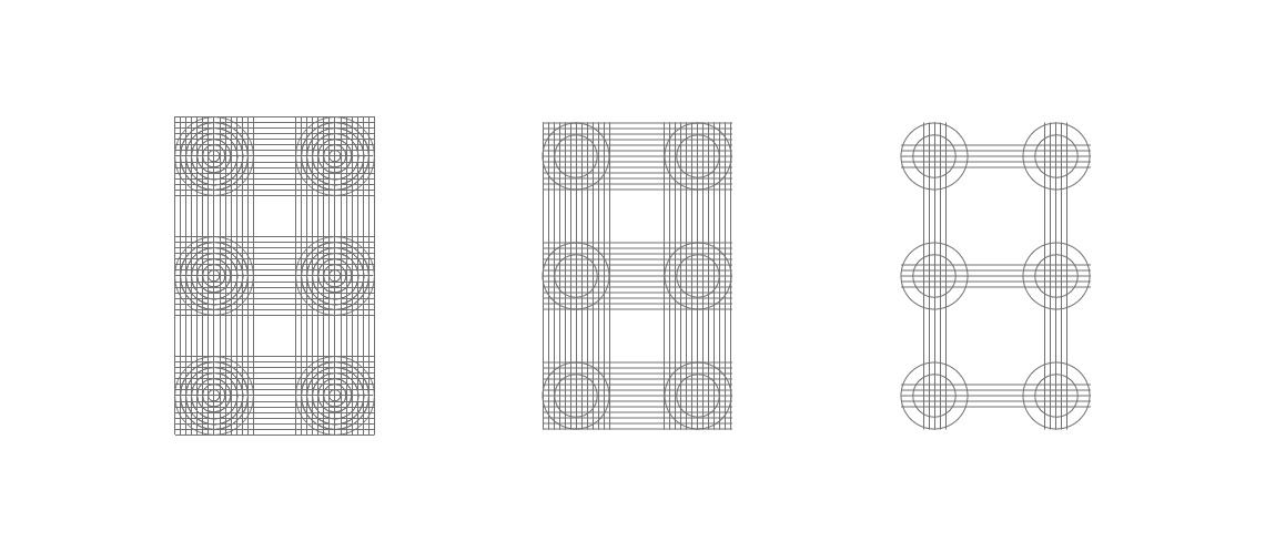

Prototype
I printed these rough scribbles and embossed them to check their readability and legibility. But it had a few problems. That font was not good to look at and also had readability issues. So I thought of improving or simplifying the font even more.
Thickness
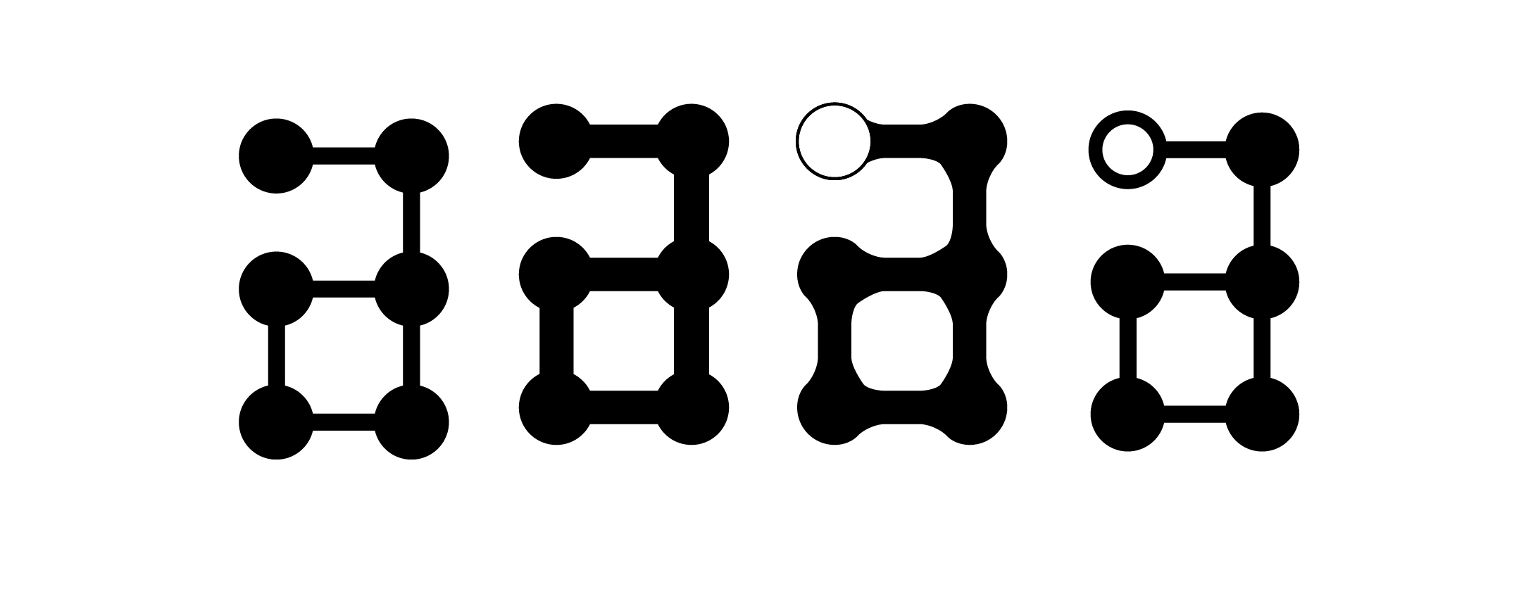
In this step, I played with the various thicknesses of circles and lines to connect the dots. I kept the thickness of the dots more than the lines that made the roman alphabet. Third I tried the reverse of what I did in the second and the fourth, I did the opposite of first. This is what looked nice and so I finalized it.
Removing unnecessary dots
Earlier, I had printed all the six dots of the grid. This made it difficult to read for those who would read it not by touching it and disturbed the aesthetics too. I took opinions and removed the unnecessary dots from the grid.
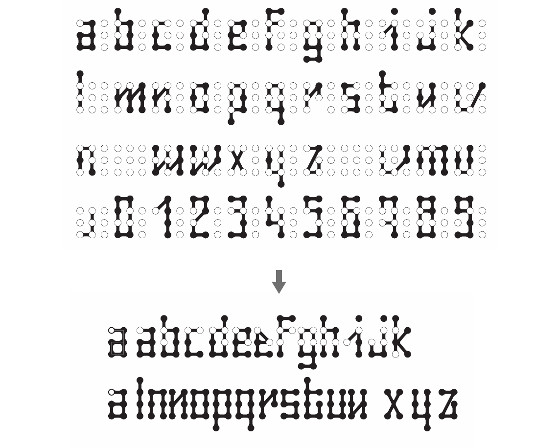

Final Output
After doing a lot of rough scribbles, testing and making numerous modifications and improvements according to the needs. I came up with a font which had all the alphabets from A to Z and numerals 0 to 9.
Applications
Thinking of application of this particular font was a challenge. Choosing the apt places to use the font was done keeping in mind the various places where there is a chance for a visually impaired person can get cheated or face difficulty in performing an activity. I thought of such situations or places where a blind person can be cheated by anyone who can see and read. These are tickets and price tags, directions instruction manuals of various things etc. In short, small printed documents where braille fails. The motto behind doing this was so that the visually impaired person can never be cheated and they feel more confident to interact with a visually able person like one among them without any apprehensions.

Railway Tickets & Price Tags
Usage
- Developing a font that is easily readable by visually impaired people as well as non-visually impaired people at the same time.
- Wide usage of the font in different areas like railway and bus tickets, price tags, bills, books other important documents which will reduce the chances of blind people getting cheated and ensure that they participate in all the social activities like a normal person.
- No wastage of space as you don’t have to repeat it twice in both the scripts, the same font can be read by both normal and blind people.
- Create and follow the grid for font creation.
Conclusion
Ebraille is an attempt to make life easier for blind people and making them feel more confident. It is an attempt of bringing visually impaired and visually able people on the same platform and not letting the disability come in between. I have sincerely tried to reduce the problems and shortcomings in the existing Braille font making it easier to use even by visually able people who do not have basic knowledge about braille font.
Future Plan
The motto was just to bridge the gap between the visually impaired people and those who can see and impart more confidence to visually impaired people to interact and communicate freely with non-visually impaired people without any hesitations or difficulties. The various applications I did were a few of the places this font can be used. But the font has a lot more scope and potential and can be used in many more places and facilities. With even more use of this font many other applications like printing books, instruction manuals etc. which can be read by both the community can be done which makes lives of blind people even more easily without creating any difficulty for normal people. Introduction of this font is an attempt to bring the visually impaired and the visually able people closer and together thereby create harmony among people.
CAG Award
Typographer of the year - (2013 - 2014)