Overview

Indian government records and releases vast quantities of data about us and our surroundings by means of the census, crime, budgets, population human development reports etc. The national crime record bureau under the ministry of the home affairs is sharing the crime data at different levels which can be used to find insight about the crime rate in India and can prove to be very helpful to analyze the cause of crime up to a certain extent.

This project aims to enable an easy way to visualize the crime data of India. This is done by means of a web-based application of open data visualization tool given by OGD platform. The higher goal is to enable faster and better decision-making by means of data visualization.

The series of interactive visualization will help people to understand the crime data from India. Interacting and observing the crime data visualization will help the user to find correlation, causes, effects and trends.
User Studies

A method of contextual enquiry was employed to conduct the user study. The enquiry aimed to generate insights about the type of visualizations used by the user group and the needs and problems faced while making strategic decisions. A semi-structured interview was conducted for different types of users.

User Interviewed

  • Police (2)
  • Editors (2)
  • Social Scientist (1)
  • Professor (1)
  • Architecture (1)
  • Students (2)
  • Other (2)

Questionnaire

  • How do you use crime datasets?
  • Where do you find these data?
  • When was the last time you had to use one of the datasets?
  • Did you find what you were looking for?
  • What do you wish was easier in the process?
  • How did you access the Information, what medium did you use? (mobile, desktop, registers etc.)
  • What data should people know about? What matters?
  • What are the important parts of the data?
  • What is not so important?
  • What will you like to see using these data?
  • What data do you want to compare?

Insights

  • Police officers rarely use data viz tools.
  • Half of the data stored in registers need to be digitized.
  • People spend most of the time digging data.
  • People are more interested to see their regional data rather than other data. eg. Maharashtra's user will first check Maharashtra's crime data.
  • Data stored online and offline is in raw format.

User Requirements

  • Comparison between crimes
  • Crime against certain category vs Total crime (juvenile crime vs total crime)
  • Definition of complex data-words
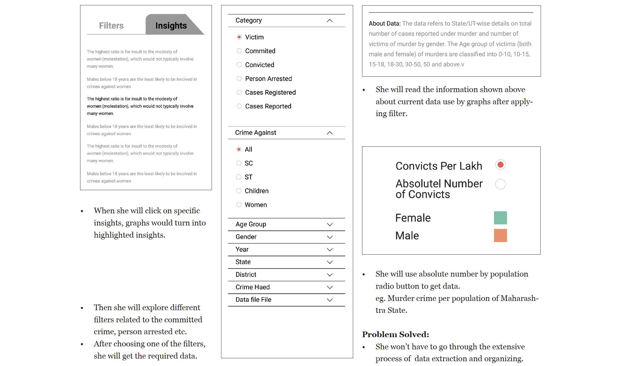
  • Pre-search, filter data, add insights, share option, archive, rating, comment on insights to minimize error.
  • Look at what other people are searching for through previous searches.
  • Number of cases with respect to women
  • How much has happened to which category
  • Five biggest crimes in every category.
  • Five largest crime states.
  • Make your own data viz.
  • Show recent cases on the timeline.

User Objectives

Based on user requirements and available data set objectives are decided.

  • Show a comparison between all crimes.
  • Show a comparison between all states.
  • Show relations between data.
  • Give predefined insights.
  • Show affecting factors.
  • Need for search option for crimes and states.

Goal Setting

The stated goals of the projects evolved through the research process and available datasets. From an interactive object point of view, the goals are:

  • Providing a richer context.
  • Simple to grasp visualization and interactions.
  • People should be able to find insights and trends.
  • People should be able to correlate information.

Design Approach

Based on available data, user requirements and feature list, the decisions have been made to use widescreen(desktop, for instance).

Why Desktop?
A widescreen with data viz having detail data and its insights will allow the user to interact with the data. Also, it gives the user a bigger space for the interaction. In the user study, we found, most of the users use laptop and desktop to check crime data. E.g. Police stations have a desktop to analyze crime data.

Design Exploration

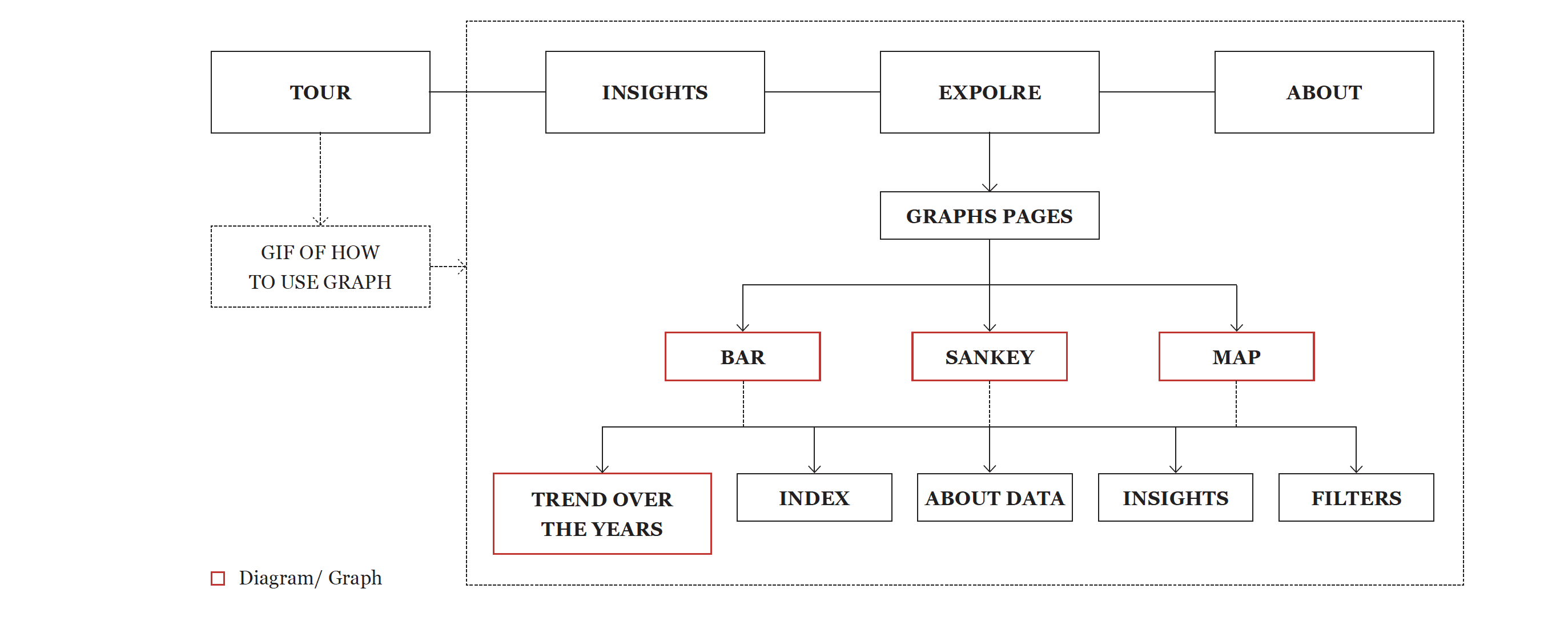
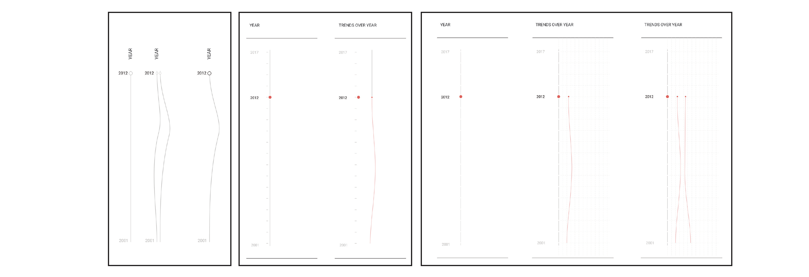
Information Architecture

Design

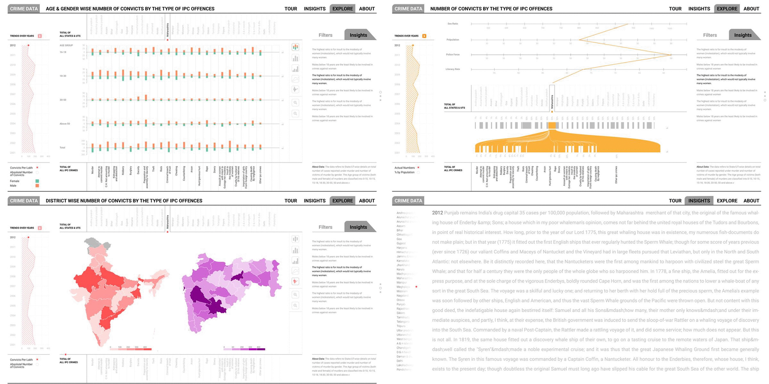
IAn analysis of the initial design ideas and their limitations along with the user requirements from the user studies led to the formation of the Crime Data Tool. The final design is the iteration and additions of all design explorations.

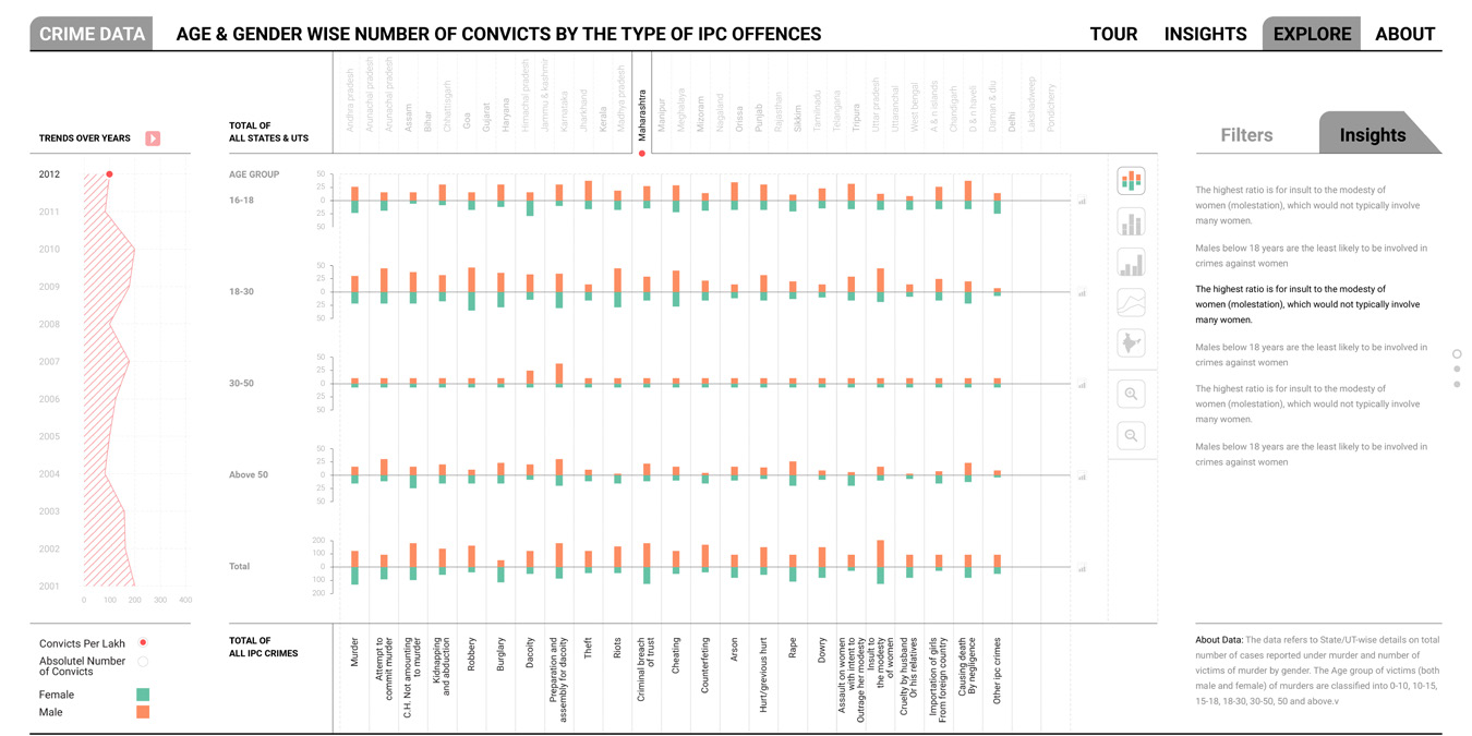
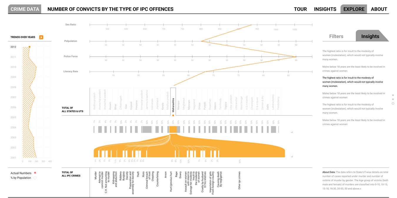
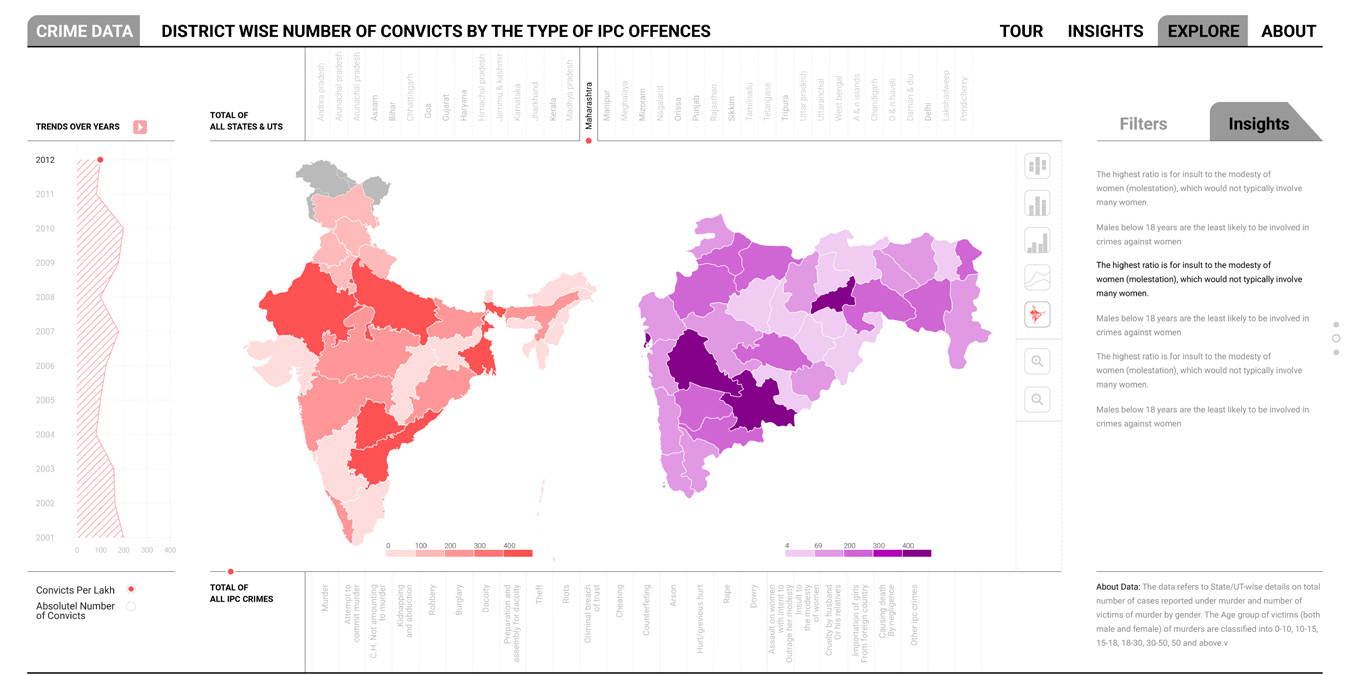
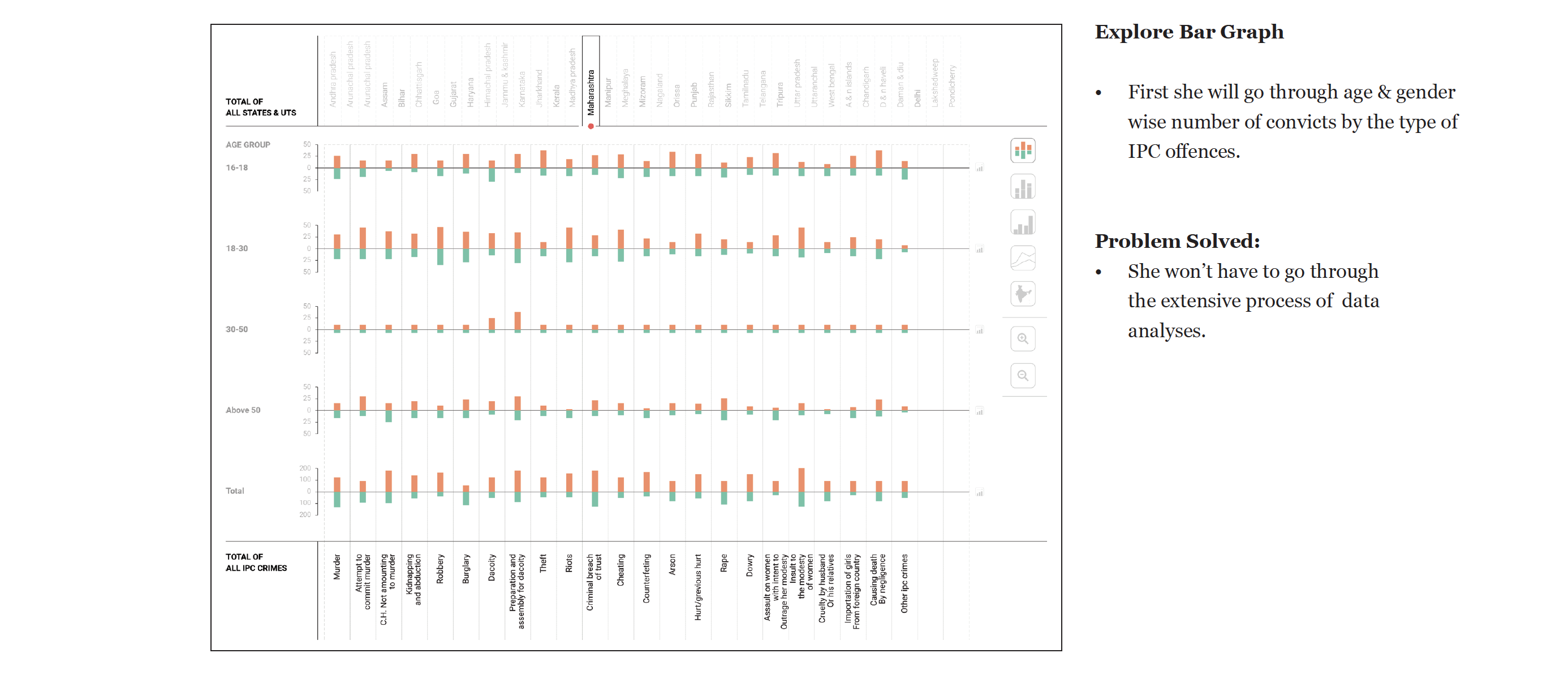
Final design contains three specific graphs for specific data set. Eg. The divided bar graph to show age and gender.

Bar Graph
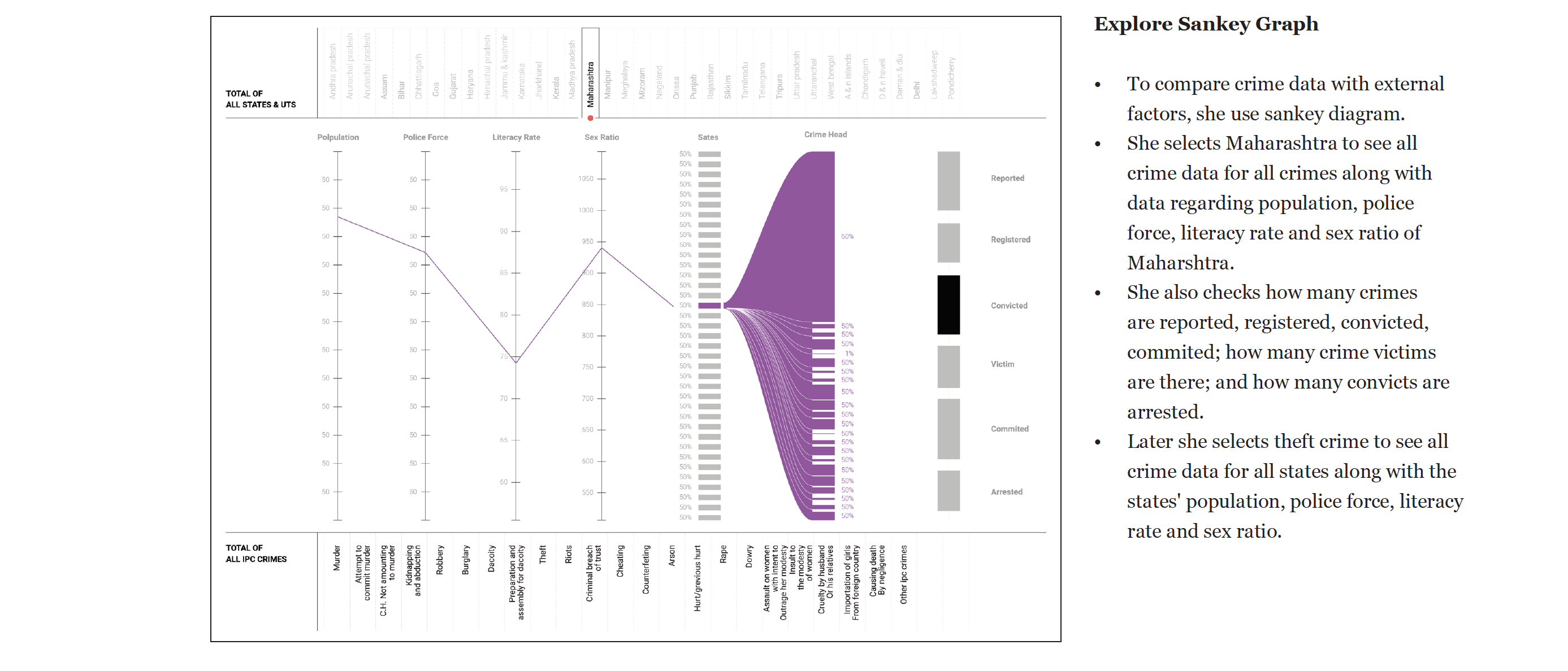
Sankey Graph
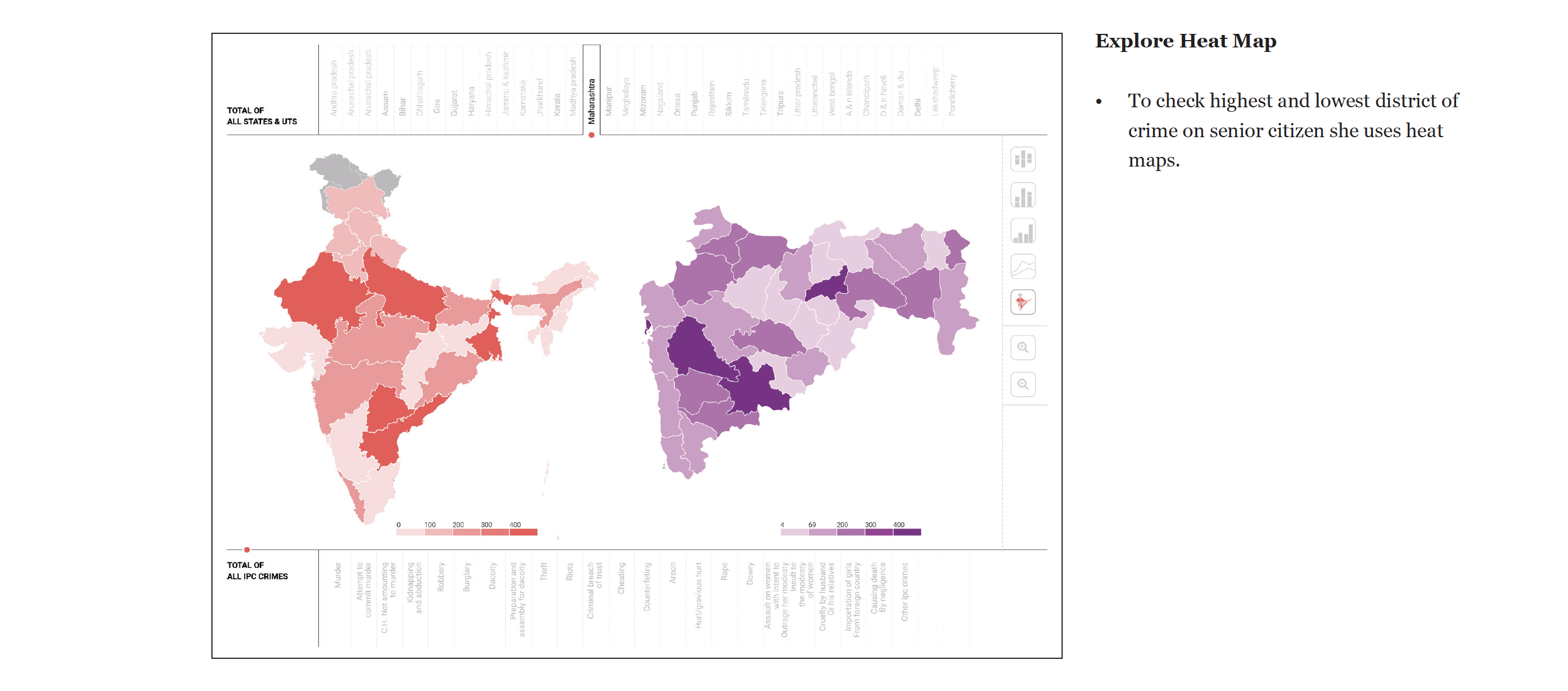
Heat Map

Workflow Through Scenario

Scenario 1

A journalist of a national daily has to write a report on a crime that has happened on a senior citizen. For that, the reporter needs an ample amount of background data regarding that particular kind of crime to present as the premise of the report. This data also helps the reader to have a relative perspective of the crime happened and hence, is necessary.

Without Crime data visualization tool

  • The journalist will have to go through many resources, both online and offline to gather the data.
  • At the same, she will have to validate it from the various sources and analyze it further.
  • If it is raw data she will have to extract different data pieces, perform various graph analysis in order to organize it and then present it in reference to the context of the crime happened.

Crime data visualization tool

  • he will search for crime data on the internet.
  • She will open ‘crimes in India’ website.
  • If she is visiting first time to the site then the site will give a small tour about how to use the tool through preloaded insights.
  • If she has already visited then she will skip the tour and start with the graph exploration.

Objective of Evaluation

The purpose of evaluation for the project is to understand the usability, feasibility and conceptual issues with the Crime Data Visualization Tool on multiple form factors.

What to test?
  • To evaluate the usability of the user interface.
  • Findability
    • Filters
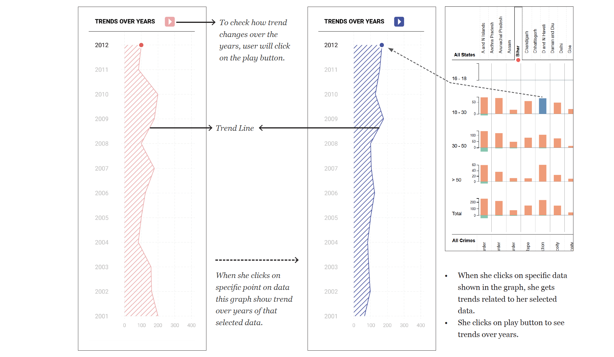
    • Trend
    • Insights
  • To check the find-ability of the datasets.
  • To examine the utility of the Crime Data

Protocol for Evaluation

A think-aloud test was conducted for user testing. The participants have to use the tool while continuously thinking out loud, or verbalizing their thoughts as they move through the interface or perform the tasks given. It is assumed that users know English.

Protocol for the Think Aloud Test
  • Ask the user to filter the dataset of his choice.
  • Ask the user to explore the data
  • To check the find-ability of the tool, give the slightly complex task to the user.

Step 1: let the user explore data viz. (think aloud)
This is to familiarize the user with the Visualization Control Panel and it will help the user to understand data.
Step 2: Give a data viz tour. if they don’t understand the visualization.
Step 3: Task

  • Which state has the most number of burglaries in 2001? This is an early success task to instil confidence in the user.
  • Find out Gujarat’s Arson trend in 2003.
  • In 2012, which age group and which crime has the maximum number of convicts in Uttaranchal?
  • Find out the trends of women affected by “Cruelty by Husband or Relative of Husband” of West Bengal state in 2008.
  • Give the list of states which have the lowest kidnapping and abduction in 2011 against women.
  • Try to find some insights within 5 min.

Step 4: Ask questions and fill the google form.

  • Are you familiar with interactive visualization?
  • Used graphs are appropriate graphs for the data set?
  • Is it useful information?
  • Did you find, what you want to find?
  • Overall ease of navigation
  • Ease of Bar Graph
  • Ease of Navigation - Map
  • Ease of Navigation - Sankey

Findings of Evaluation

The purpose of evaluation for the project is to understand the usability, feasibility and conceptual issues with the Crime Data Visualization Tool on multiple form factors.

Based on step 3 tasks
  • As they started using visualization, users' conceptual model improved.
  • For ease of navigation and understanding, the user prefers to use Map Diagram, followed by Bar Diagram and Sankey Diagram.
  • Used graphs are appropriate for data sets.
  • The user found given data visualization very useful.
  • The user was more interested to know gender-wise crime details and crime in their states.

_/\_

Thank you to everyone

for making this project happen!

Guide: Pro. Venkatesh Rajamanickam